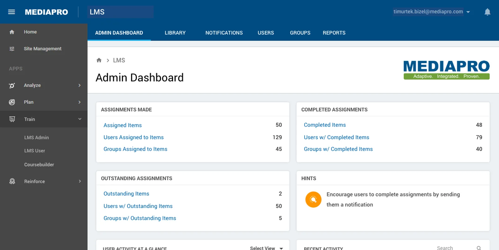
MediaPRO built security and privacy awareness training for enterprise compliance teams. I was the UX/UI designer from November 2016 to January 2018, across the admin product, the learner experience, and the self-serve funnel that let a small business buy a program without talking to sales.
The work is eight years old and the visual language is Material Design of its era. It is here for one reason: it is the earliest place the design-systems discipline this site keeps claiming is actually visible, and the decision at the center of it is the same one the Elsa Design System survived five themes on, four years later.
Color named by role, not by value
The palette was never a list of colors. It was a list of jobs.
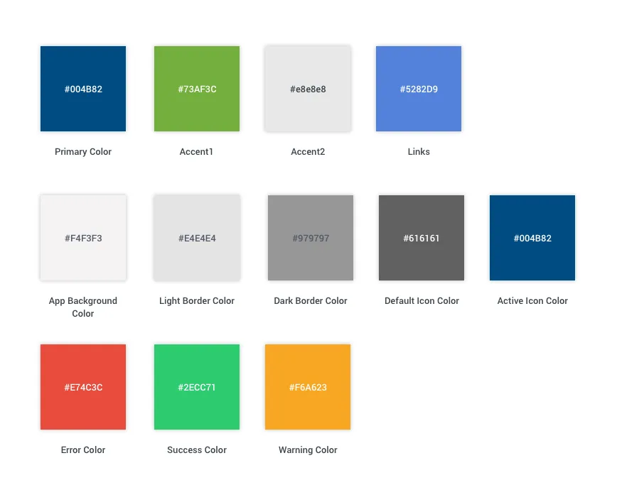 The system as the product shipped it. Every swatch is named for what it does, not for what it looks like.
Primary, Accent1, Accent2, Links. App Background, Light Border, Dark Border. Default Icon, Active Icon. Error, Success, Warning. Not one of those names contains a color.
That sounds like a small piece of hygiene until you see why it was necessary.
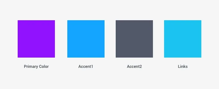 The same four roles, a customer's values. Nothing in the components changed to produce this.
The reason: the customer picked the values
MediaPRO sold training a company delivered to its own staff under its own brand. So re-branding was not a redesign project. It was a step in onboarding, between adding users and turning the program on.
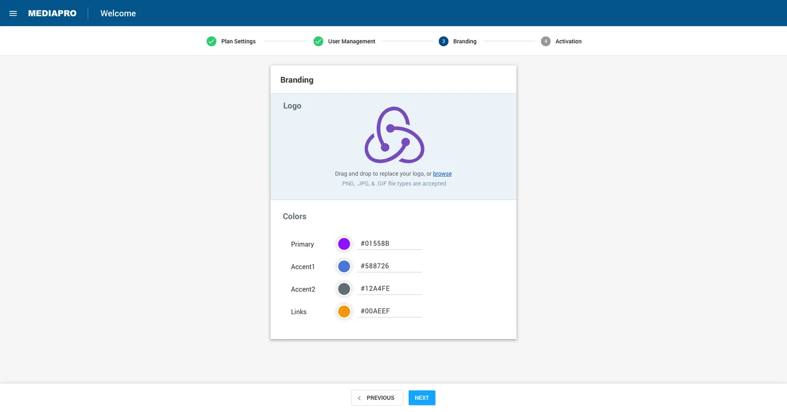 Step three of four. The customer drops in a logo and types four hex values into the roles the system already had names for.
Four inputs. The same four names from the palette sheet. A customer who had never heard the phrase design token was filling in the token file.
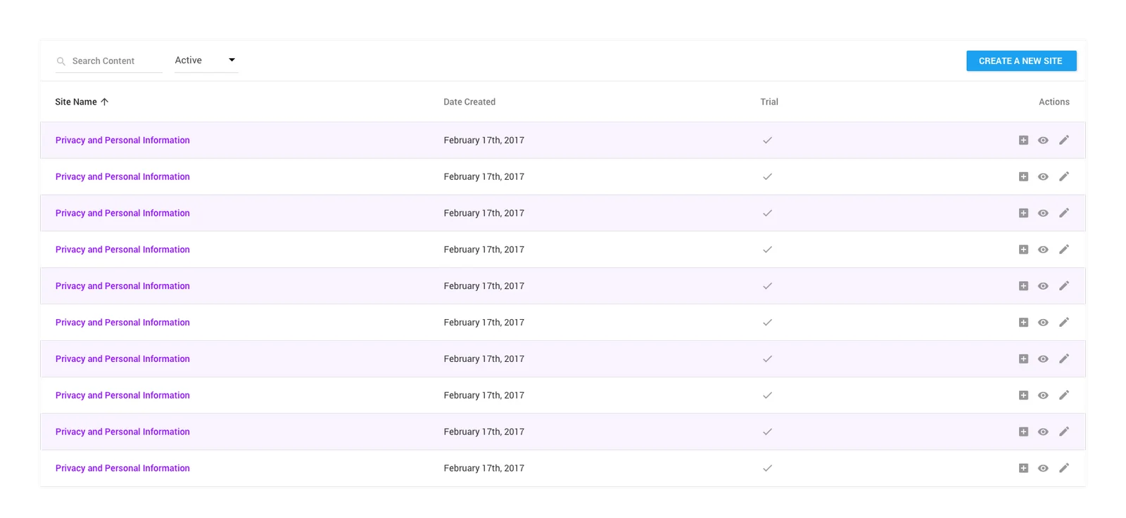 The payoff. A component nobody edited, wearing a customer's brand, because the values were never written into it.
That is the whole argument, and it is the argument I would make again on Elsa in 2020 and write into the Elsa case study as the reason it did not collapse under its second theme: name tokens for intent, and a brand change edits a file instead of touching components.
The rest of the system
The palette was one part of a library the product was assembled from: buttons and their states, form controls, tables, navigation, tabs, steppers, dialogs, popovers, chips, snackbars, badges, pagination, loading states, a type scale and an elevation scale.
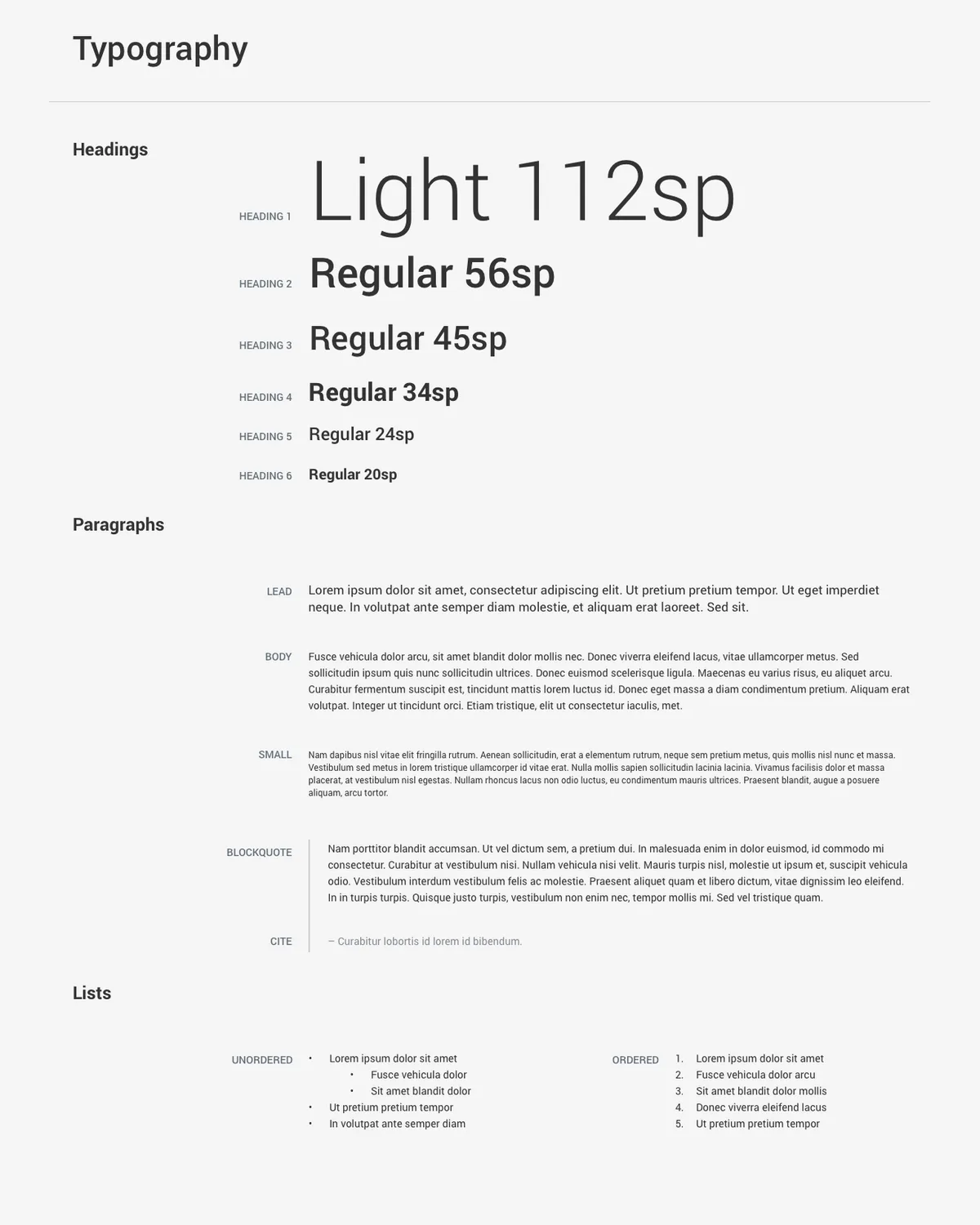 The type scale, documented alongside the color roles, the elevation steps and the spacing measurements.
The product it built
Two surfaces, on the same library.
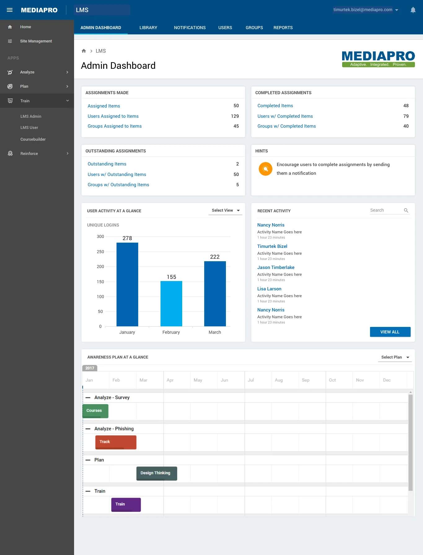 The admin dashboard. Assignment counts, activity, and the year's awareness plan on one screen.
The admin side is where a compliance team runs a program: learning materials, users, groups, reports, a content library, a learner dashboard, and site management across multiple client sites.
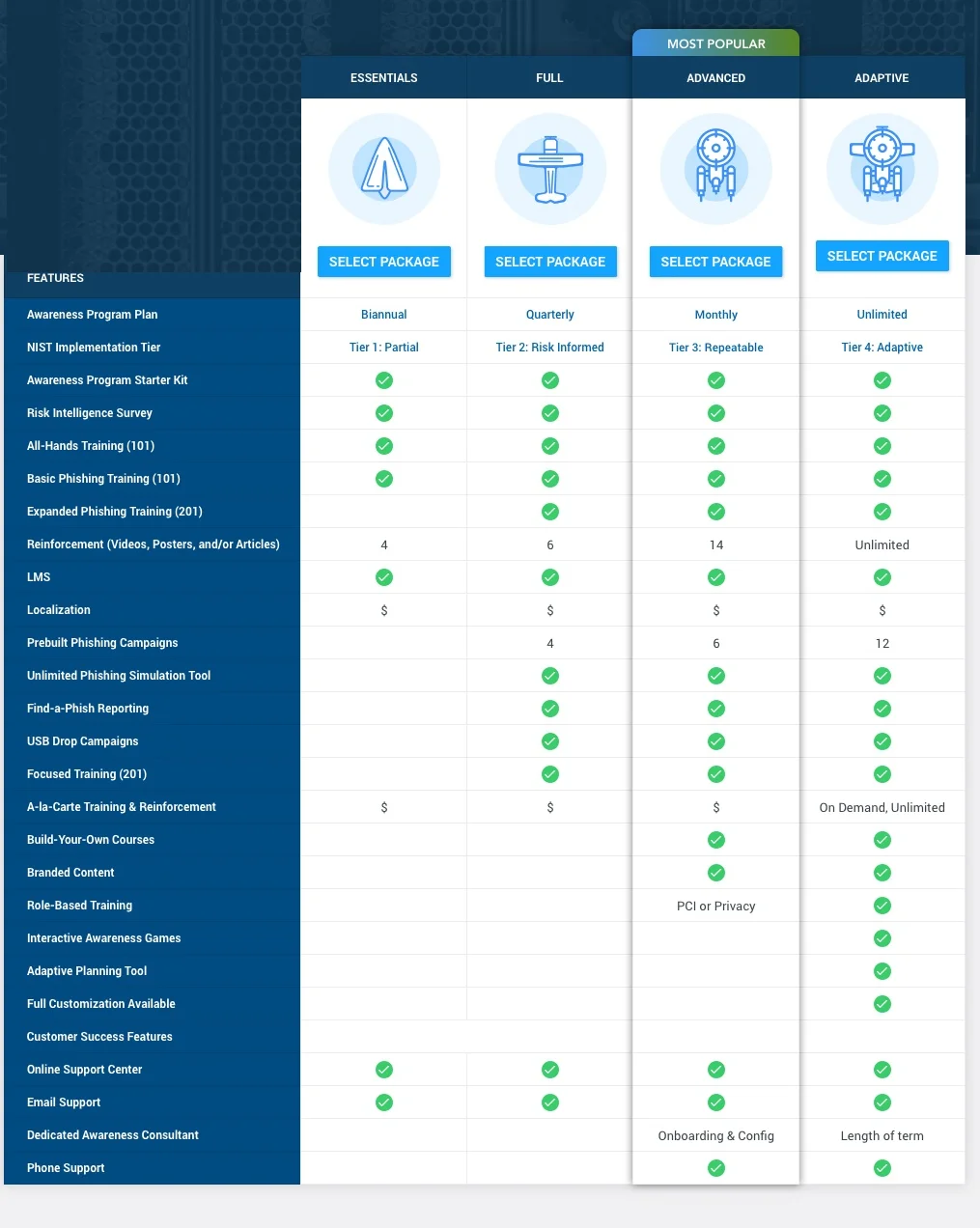 The self-serve funnel. Four tiers against a feature matrix, so a small business could size its own program.
The funnel is the other half: pick a tier, pay, confirm the profile, then a four-step onboarding through plan settings, user management, branding and activation.
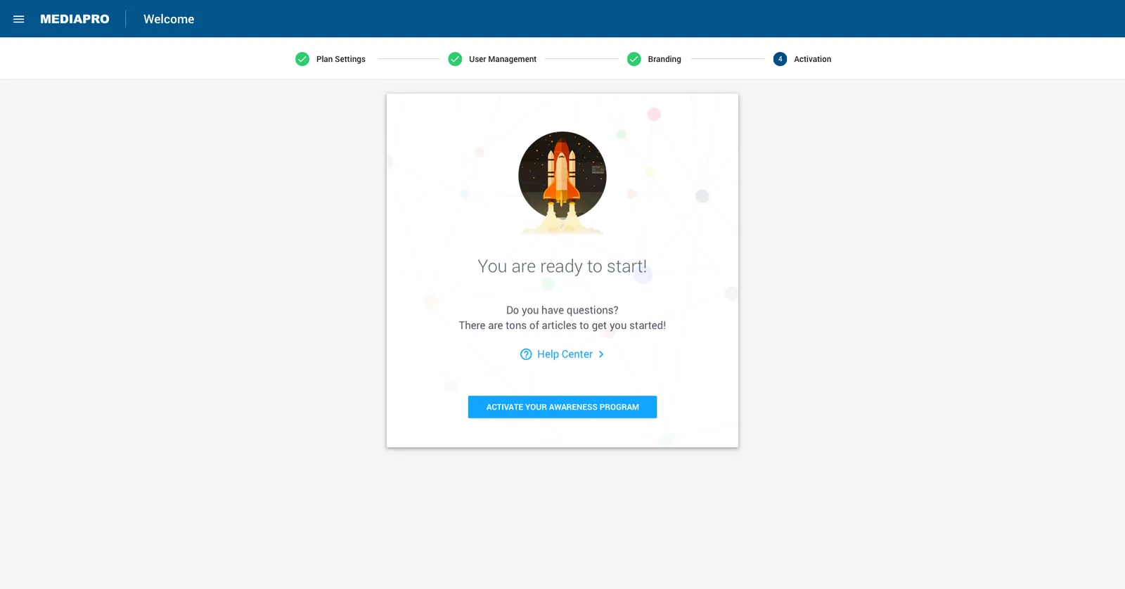 Step four. The program goes live without a sales call or an implementation consultant.
What it taught me
Give a thing a name that describes its job, not its current value, and the system survives the change that comes later. At MediaPRO the change was a customer's brand; on Elsa it was a fifth theme. In both, a value written where a reference belonged would have worked fine, right up until the first customer asked for their own colors.
Naming is the cheapest architectural decision available, and the one that decides whether anything after it is possible.