

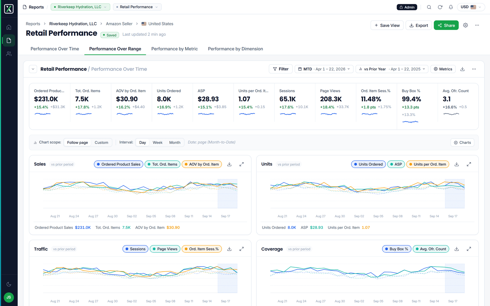
Report Center is where a MixShift customer actually works: the reporting surface an agency or brand opens to see how their Amazon accounts are performing. Report Center 2.0 was its rebuild. I am the named design co-owner on every version of the specification, and the frontend lead who shipped much of it.
The screens below are from that prototype, with every figure and account invented. They are a selection: the interface itself is MixShift's unreleased product, so this shows the shape of the work rather than the whole of it.
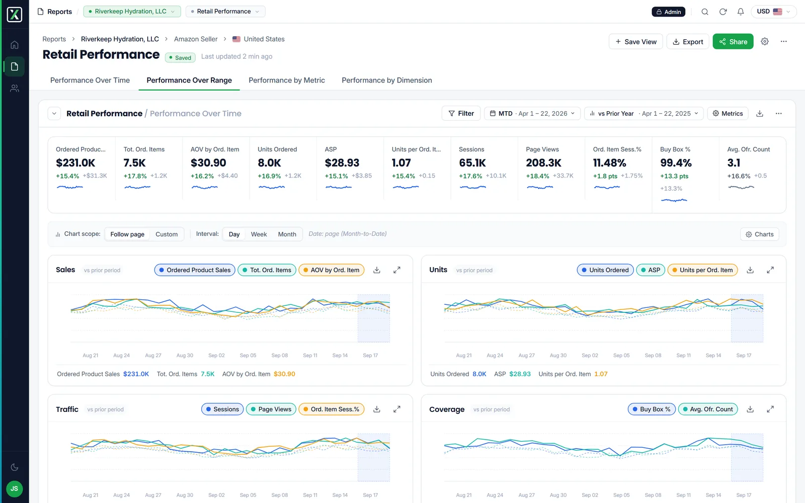 The report page. Scorecards, the chart pair, and the dimension table that carries the detail.
At a glance
- Role. Design co-owner of the specification, frontend lead on the implementation.
- Delivered. A working React application, not a mockup set. It was reconciled into the written specification across a dozen changelog entries, and superseded it.
- Preceded by. A solo UX audit, a features inventory of the existing monorepo, an eighty-five-story user-story catalog, and a build-order handoff.
- What it shows. That I can hold a product's hardest surface from first audit to merged code without the argument ever leaving running software.
The problem
A data-heavy product accumulates reporting surface the way a house accumulates extension cords. Every new metric earns a column, every customer request earns a toggle, and nobody owns the whole. By the time 2.0 started, the existing Report Center had real defects a customer hit daily, and no single document said what it was supposed to do.
Before the design, an inventory
You cannot specify a replacement for something nobody has described. So the first work was not design at all.
A solo UX audit of the shipped product enumerated about twenty concrete defects: no dark-mode detection, broken table sorting and pinning, no saved views, no filters, no live currency rates, no drag-and-drop metric ordering, a chart watermark on a paid product. Most of those became work items rather than opinions.
A features inventory came next. I walked the whole monorepo and wrote down what the code actually did, which is a different document from what anyone believed it did. The specification's changelog reconciles against that inventory, repeatedly, which is the only reason the spec stayed honest as it grew.
Then an eighty-five-story user-story catalog, which became the specification's appendix, and a handoff document that partitioned the entire beta queue into UI-only, mixed, static-config and parked buckets with a suggested two-week build order. That last one exists because a specification that does not tell engineers what to build first is a wish, not a plan.
The design, as an application
The design was not delivered as mockups. It was delivered as a running React application: the shell, the brands list, the report pages, the filter, share, save-view and password modals, the viewer lock, toasts, telemetry and fixtures.
That choice is the argument of this project. A mockup can show a table; it cannot show what the table does when a column is pinned, the window narrows, and the sort is applied to a dimension the user just added. Those are the decisions that actually cost money to get wrong, and they are invisible until something runs.
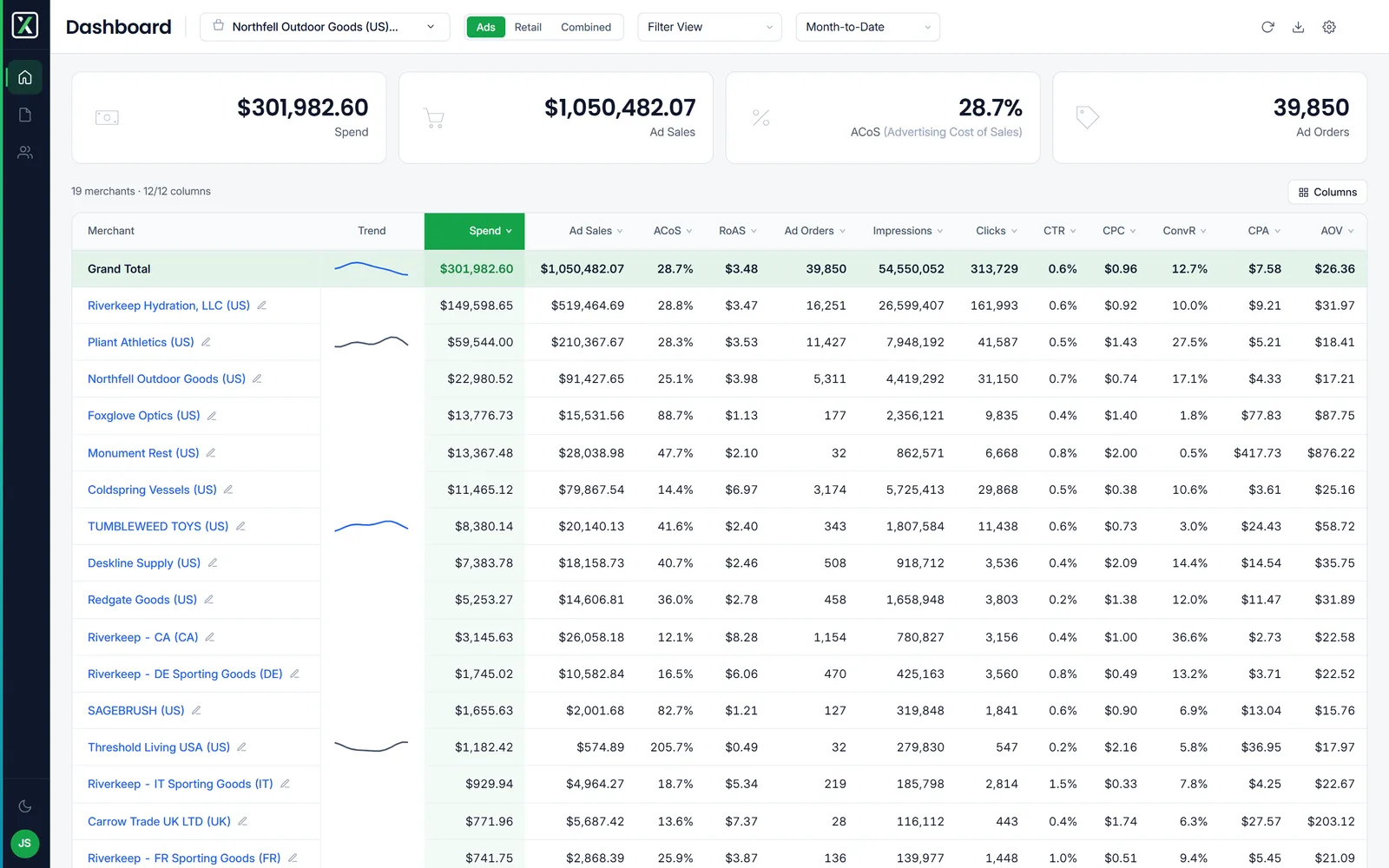 The dashboard. The cross channel rollup a user lands on.
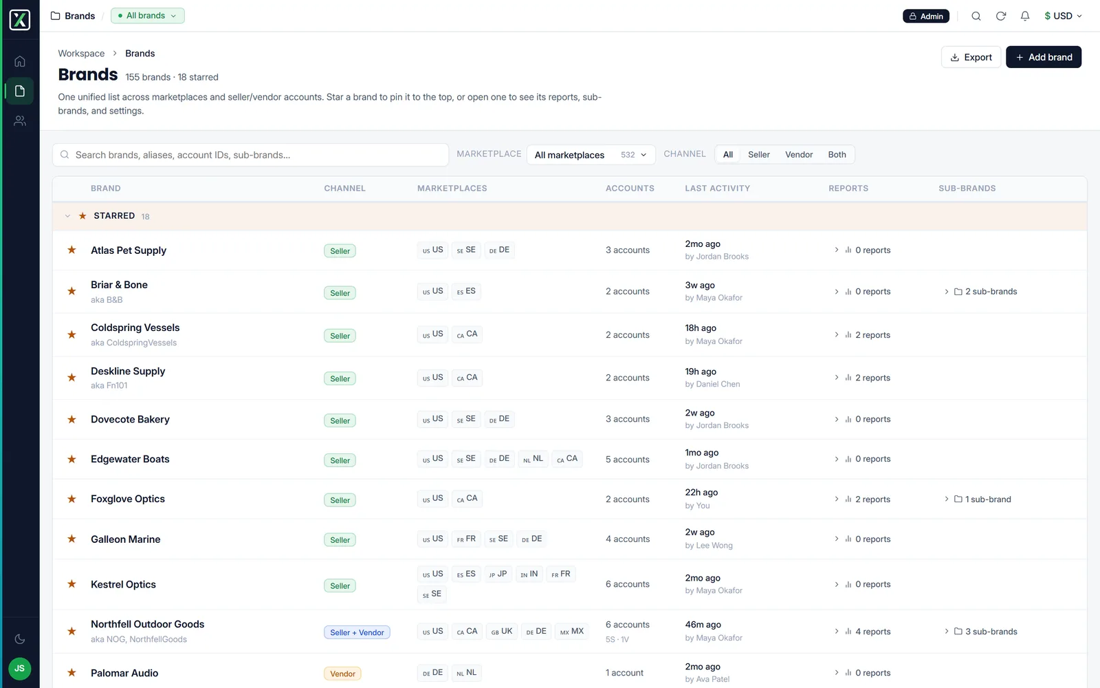 The brands list. A client identity unifying marketplaces and accounts, replacing a flat list of reports.
Some of what the prototype settled, which the written design had not:
- The landing surface changed shape. A flat list of reports became a brands list, where the client identity is the organizing unit and marketplaces and seller or vendor accounts hang beneath it. Dense rows, starring, collapsible sections, inline disclosure of a brand's reports rather than a separate page.
- A whole page was deleted. The share surface stopped being its own destination and folded into a modal on the report header, because sharing is something you do to a report you are looking at, not an errand you run elsewhere.
- Metric naming was made canonical. The legacy names and the real names had drifted apart, so the prototype carries one dictionary and the spec adopted it.
- Inverted metrics render inverted. For a cost metric, down is good. Color has to follow meaning rather than direction, and that rule lives in the formatter rather than in each component's head.
- State precedence was written down. URL, then named view, then per-section default, then app default. Persistence questions stop being arguments once the stack is explicit.
In code
As frontend lead, the implementation side was mine too: the app context layer, the shared theme and unified app configs across the monorepo, CI/CD fixes, and the product features themselves, reports, net percentage change, the date-range picker, pivot and view-by-dimension, and the share surface.
The primitives the first-run experience is built from are mine as well: empty states, KPI tiles, the trend matrix, dimension tables, brand settings, and the viewer password challenge. On the first-run flow my design decisions are recorded as locked specification items rather than suggestions, and I am in the loop on the reports data model, not only the surface over it.
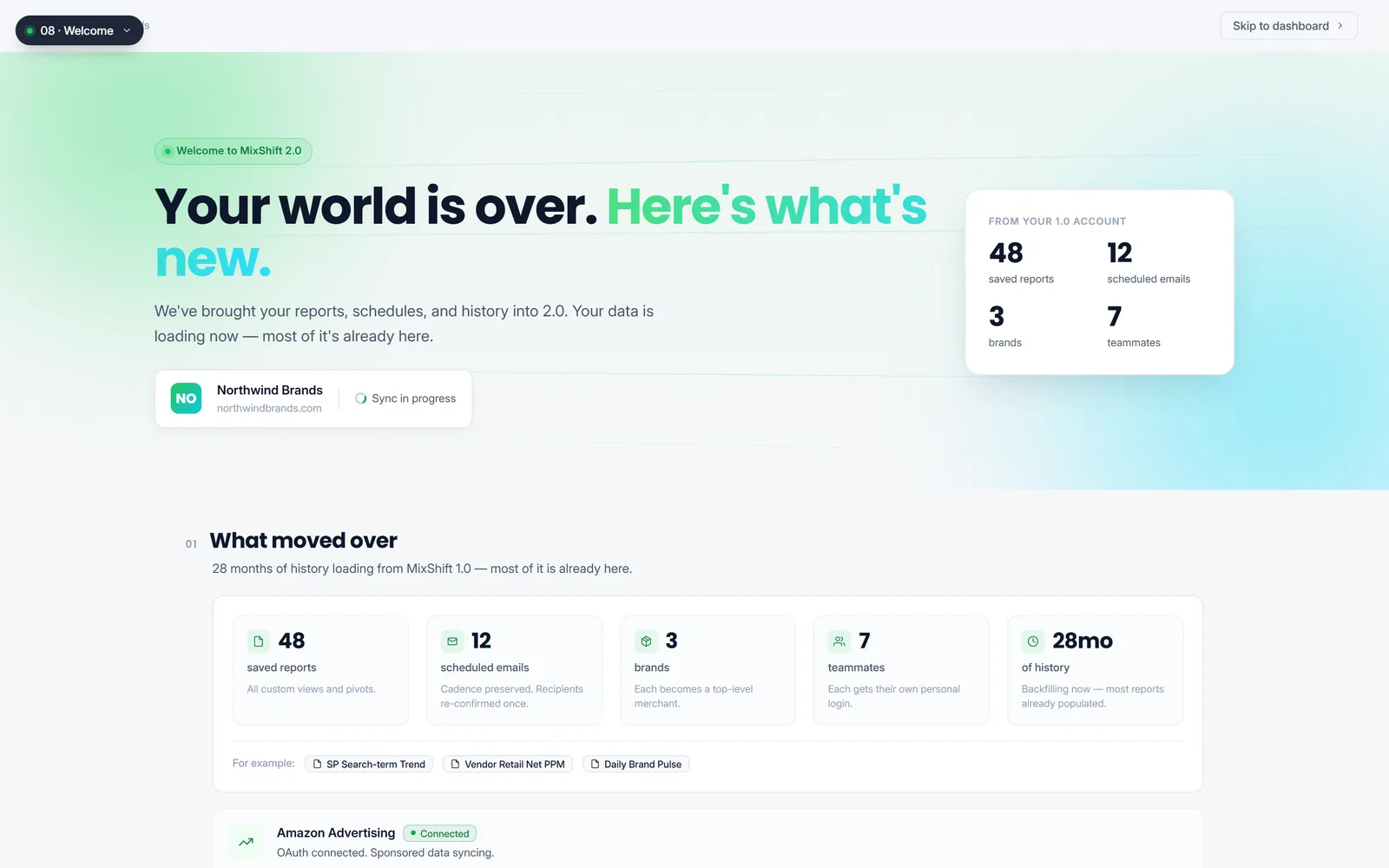 Day Zero. The first run flow, where my design decisions are recorded as locked specification items.
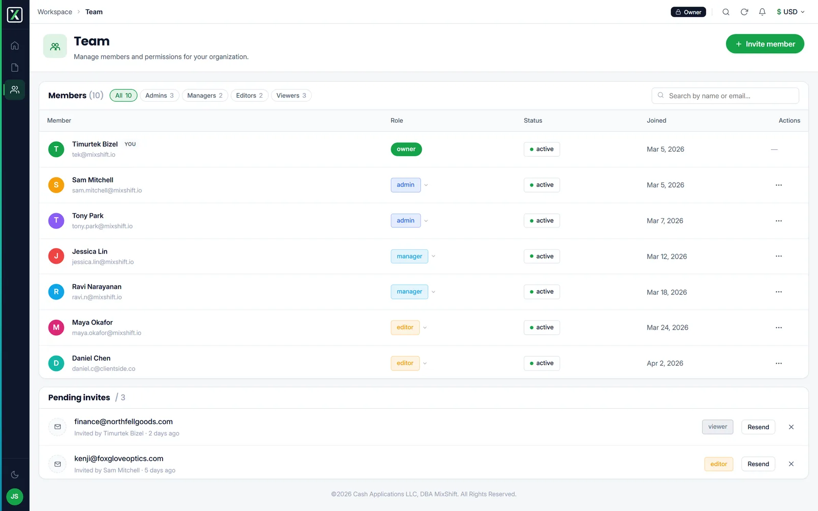 Team. Seats, roles, and the stale invitation state most permission screens forget to design.
The decision worth naming
Design in code, not in pictures. The prototype was a running application, and it became the specification. Every ambiguity that would otherwise have been settled in a review meeting was settled by something a person could click. What is above are stills of it; the point was never that a stranger can click it, it was that the team could.
The cost of that choice is real: it is slower to start, and it demands that the designer can build. The return is that the handoff stops being a translation step, and translation is where product intent goes to die.
A note on the data
Every account, brand, product, identifier, figure and email address in these screens is invented.
The fixtures the prototype shipped with were assembled from production screenshots and carried real customers joined to real revenue and advertising spend. Before any of it went anywhere, the whole data layer was rebuilt: names replaced, every base quantity re-scaled, and each derived ratio recomputed from the new bases, so the arithmetic on screen still holds while none of the numbers belong to anyone. Spend divided by clicks still equals the cost-per-click shown.
Report Center 2.0 is one strand of a larger engagement. The rest of it, the design system, the marketing site, the knowledge base and the automation underneath the team, is in the MixShift case study.