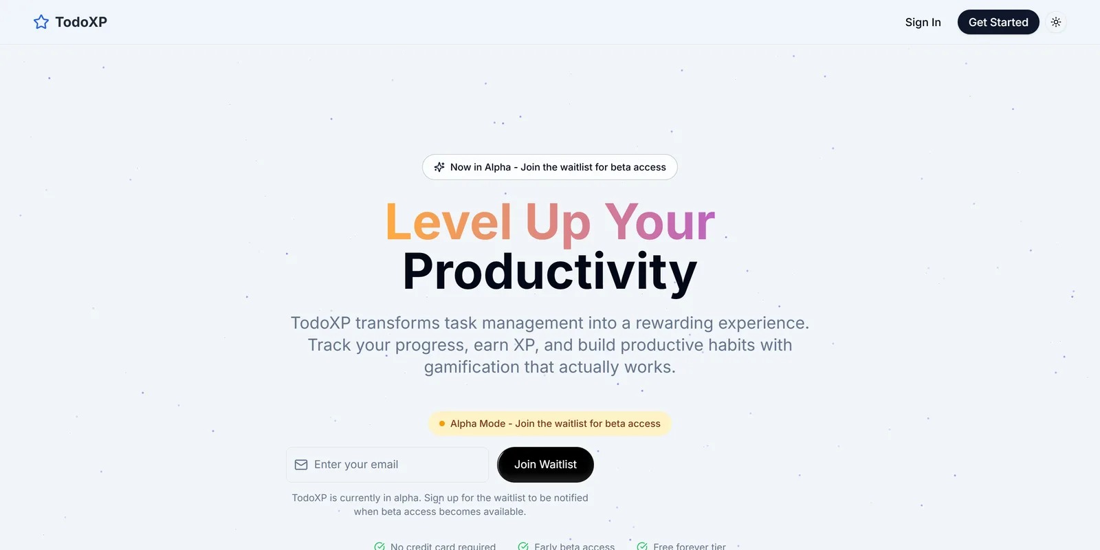
TodoXP (opens in a new tab) turns your real life into a trackable, game-like environment. The things you care about and maintain, yourself, the people close to you, your pets, your home, your possessions, become characters you actively keep in good shape. It is a behavioural productivity system, RPG and Sims inspired, built for adults. Not a game for its own sake. A discipline-and-motivation engine dressed as one.
An alpha is live at todoxp.com, with sign-ups restricted to existing users and a waitlist open for beta. In 2026 I redefined the product from the ground up, and the v1.0 prototype below is the spec for the next build.
Solo: concept, product definition, design and prototype, with Claude as the daily collaborator.
The north star
Everything exists to help the user become more organized in their tasks, relationships and goals, and to turn that into a game-like environment that gives motivation and discipline. If a feature does not support that, it does not ship.
Three pillars: tasks, relationships, goals. Relationships is a core pillar, not a deferred add-on. The Sims is borrowed from selectively, only the parts that serve the three pillars.
The model
The organizing idea is that the thing you look after sits at the center, and goals and tasks hang off it.
- Hub. Home base. Everything you look after, each with its state at a glance.
- Care. A single thing you look after. It has a type, Self, Person, Pet, Vehicle, Home or Item, a name, and an avatar.
- Task. A concrete action. It attaches directly to a Care and can optionally roll up to a Goal. One-off, recurring, or triggered by maintenance.
- Goal. Optional. An objective that groups related tasks under a Care. A plain chore lives on its Care with no Goal at all.
The worked example that shaped it: Franklina, a dog, is a Care. Her goal is Dog Health, lose ten pounds and finish a two-month course of meds before surgery. Her tasks are a daily weigh-in and meds at seven and seven. Open Franklina and you see her goal, her tasks, her history, and how well she is being kept up. Completing tasks pushes the goal forward and feeds her state.
Every Care carries that state, a simple health signal that rises as you complete the tasks that support it and gently declines when upkeep is missed. A neglected Care visibly slips and prompts a nudge. The signal is encouraging, never punishing. It motivates upkeep without inducing guilt, and that rule runs through every screen.
Energy is a daily budget, decided after a fork between two models. Physical and mental meters show how much of your day you have taken on, and the day plan forecasts where they run out.
The design
Playful premium. Game-like delight that an adult is happy to open in a meeting: rounded, warm, polished, closer to a beautifully made companion app than a cartoon. Six principles, and the first one is the product's own rule. Encouraging, never punishing. Mobile-first and thumb-first. Balanced juice, so motion celebrates the moments that matter and stays calm everywhere else. The Care is the emotional anchor, framed as a character you keep thriving, not a row in a list. And clarity under the delight, because it is a productivity tool first. Light and dark are both first-class from day one.
The prototype went through three structural versions. The v0.5 build felt off, and the diagnosis was the architecture, not the colors: two competing homes, one organized by Care and one by time; a buried primary action; too many systems shown at once; four levels of depth to tick a box; and several meters competing for attention with no clear payoff. The v1.0 rebuild fixed it with one job, one home, and progressive depth.
- Four tabs and one action. Today is home, the single answer to "what now?". Cares is where you organize. Rewards merges quests, badges, levels and the store into one place. You holds the profile, settings and shared spaces. The plus button is the one unmistakable primary action.
- Quick capture. Tap plus, type a title, done. Smart defaults fill the rest: due today, attached to the Care you are in, easy difficulty. Expand only when you want to.
- One reward beat. Tap the check and one coherent moment happens: XP counts up, today's ring fills, the task's Care nudges up its state. One "here is what that did", not five meters twitching.
- One primary meter per screen. Today shows day progress. Cares shows state. Rewards shows level. Energy is a planning aid on Today, not a HUD element everywhere.
- Progressive disclosure. The first run is the simplest loop, add a few things for today, complete, earn, see progress. Cares are introduced after the first tasks, the rest as it becomes relevant.
Two arcade-style skins were explored along the way and parked. The premium gamified direction is canonical.
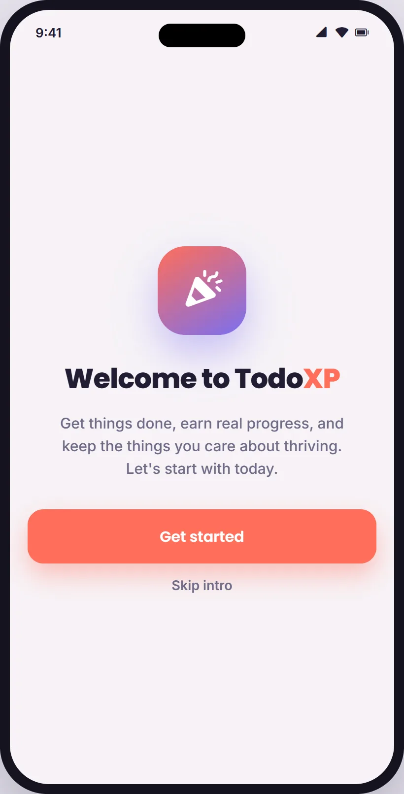
01Welcome. One promise, and a way to skip.
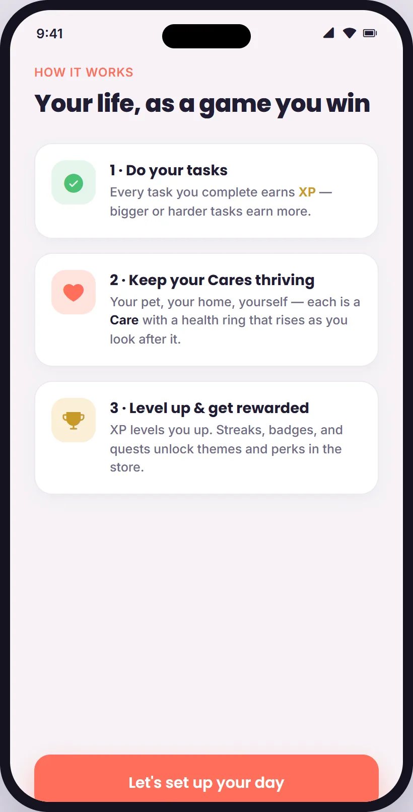
02How it works. Three steps, then set up your day.
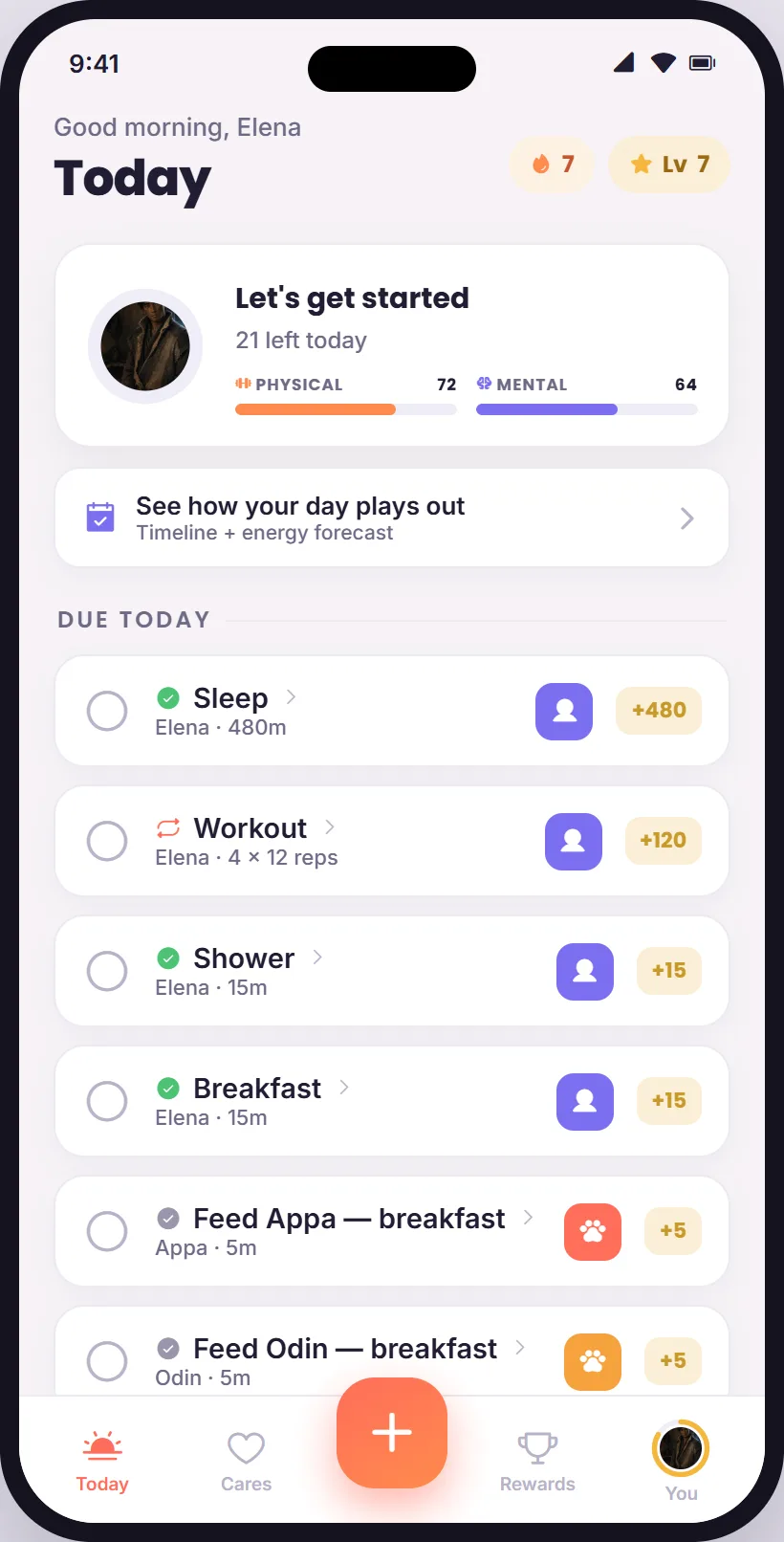
03Today, the home. One ring, two meters, the list.
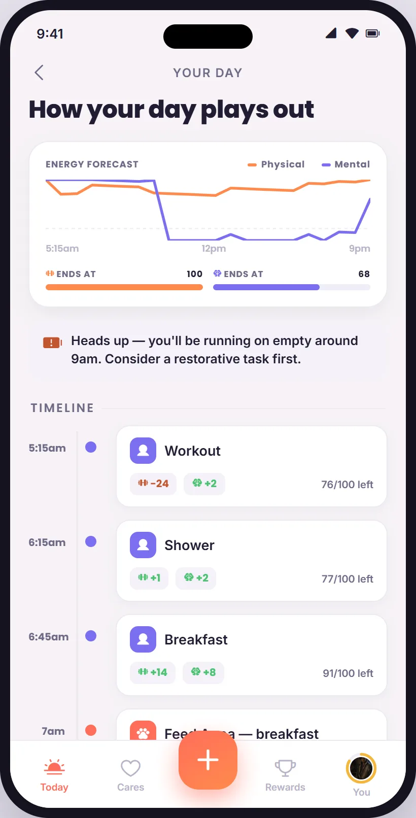
04The day plan. Energy as a forecast, with a heads-up.
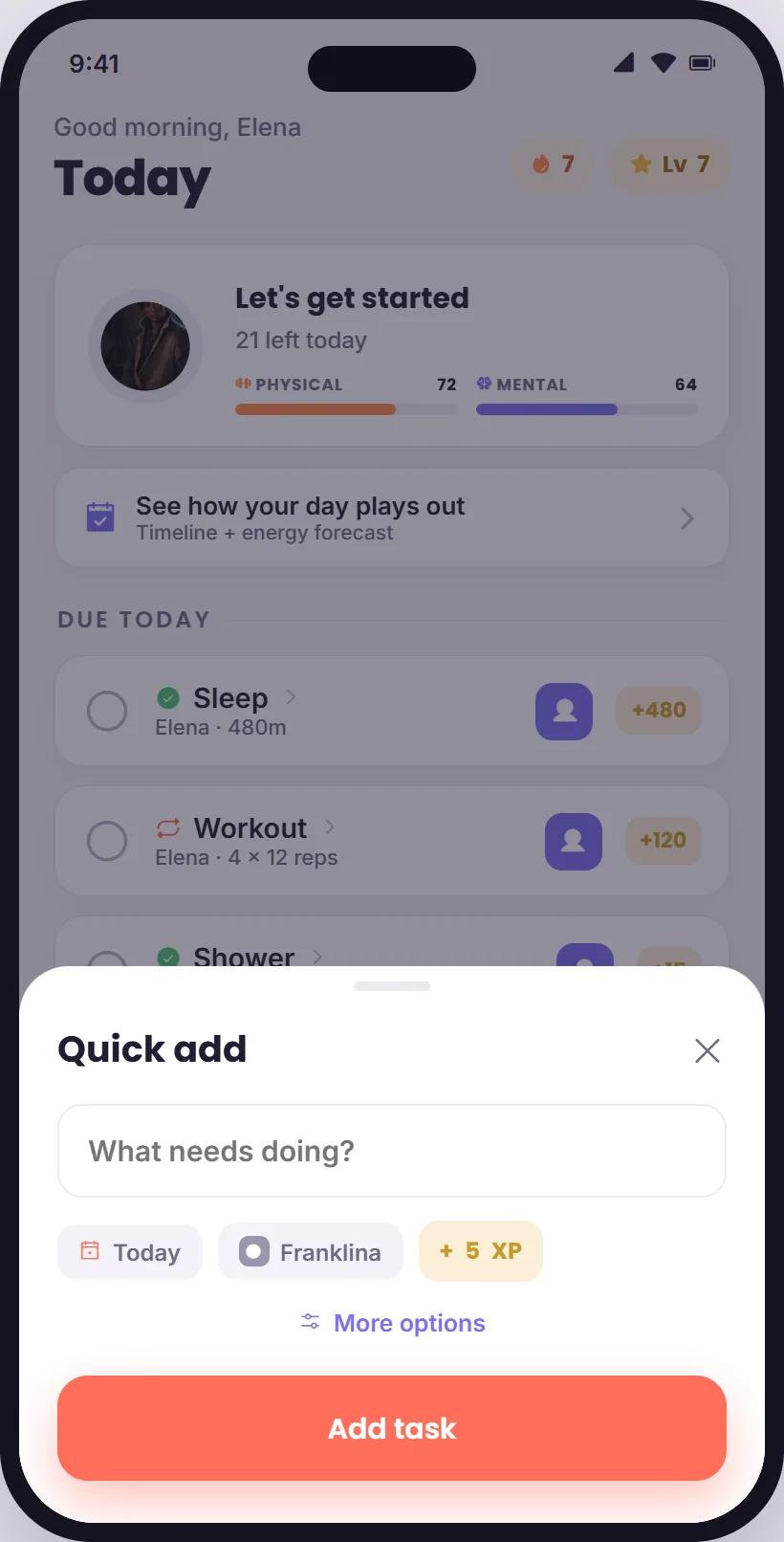
05Quick add. Type a title; the defaults do the rest.
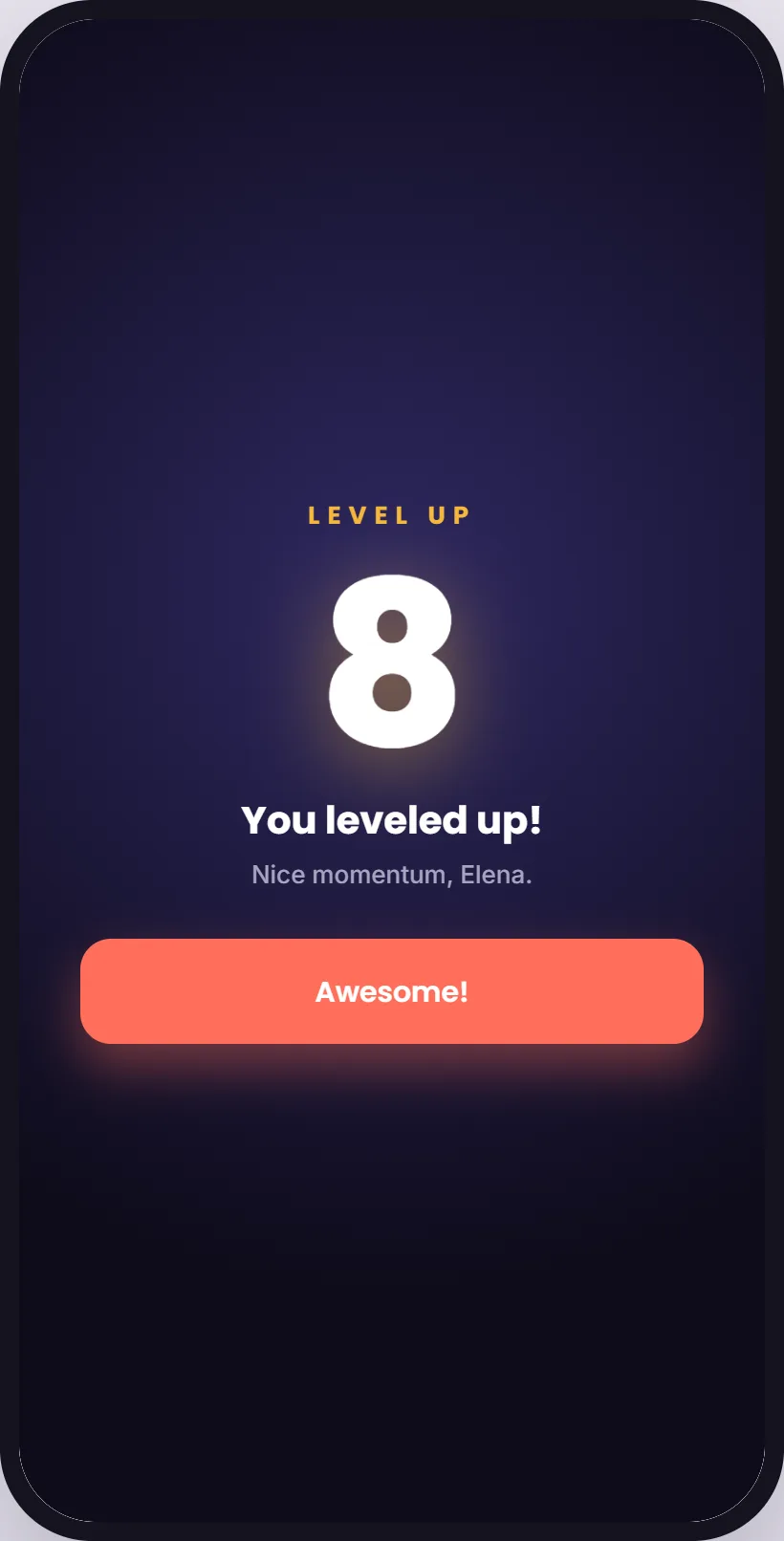
06The payoff. One beat, then back to the list.
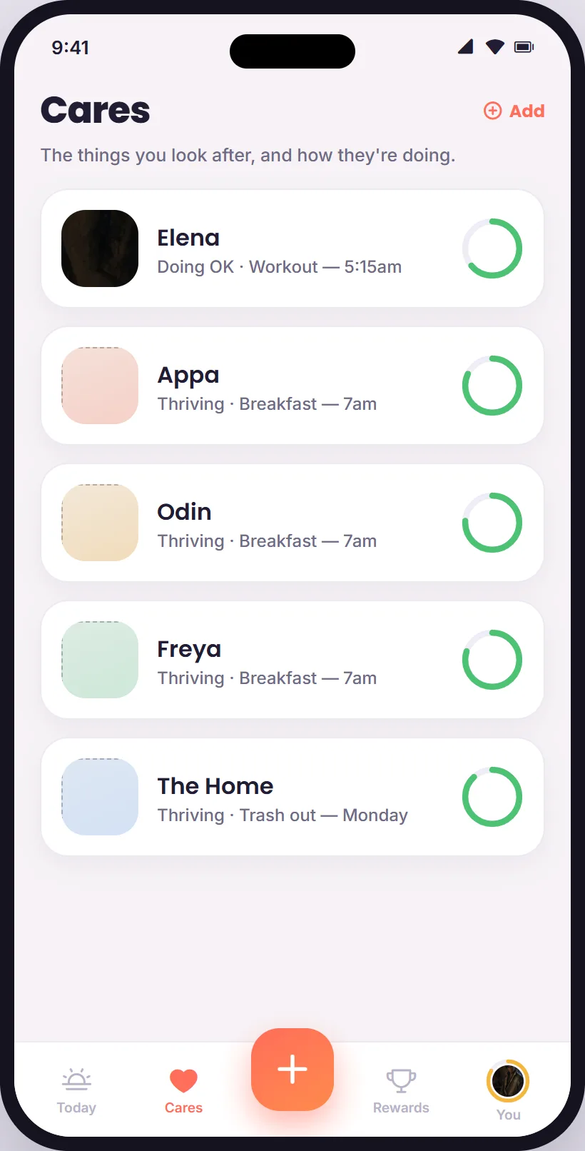
01Cares. Each one with its state ring, and what is next for it.
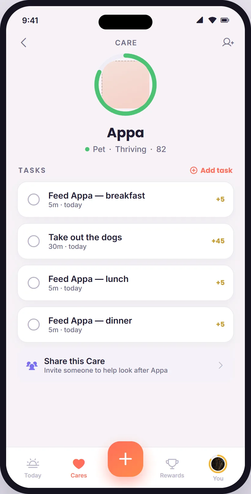
02A Care. Its tasks, its state, and a way to share it.
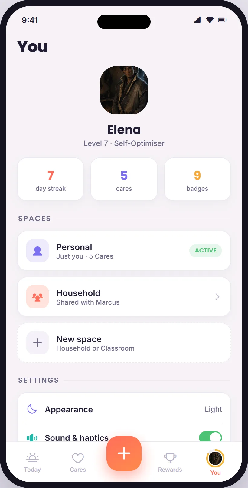
03You. Streak, cares, badges, and the spaces you share.
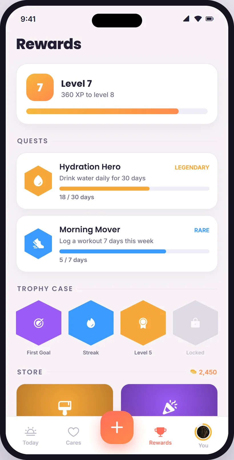
01Rewards. Level, quests, trophies, store. One tab.
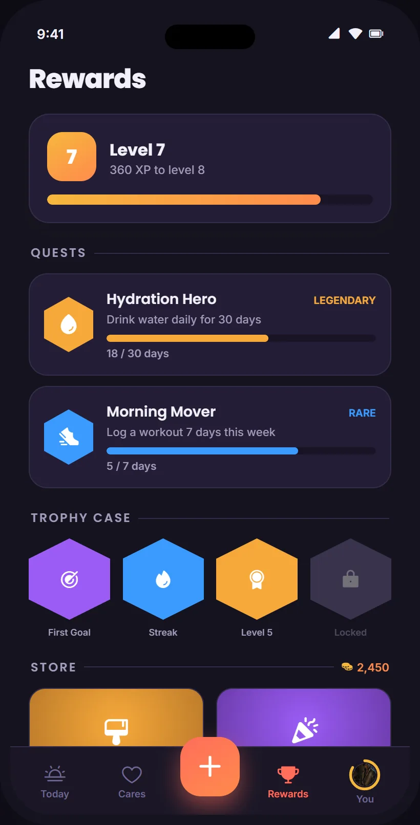
02Rewards, dark.
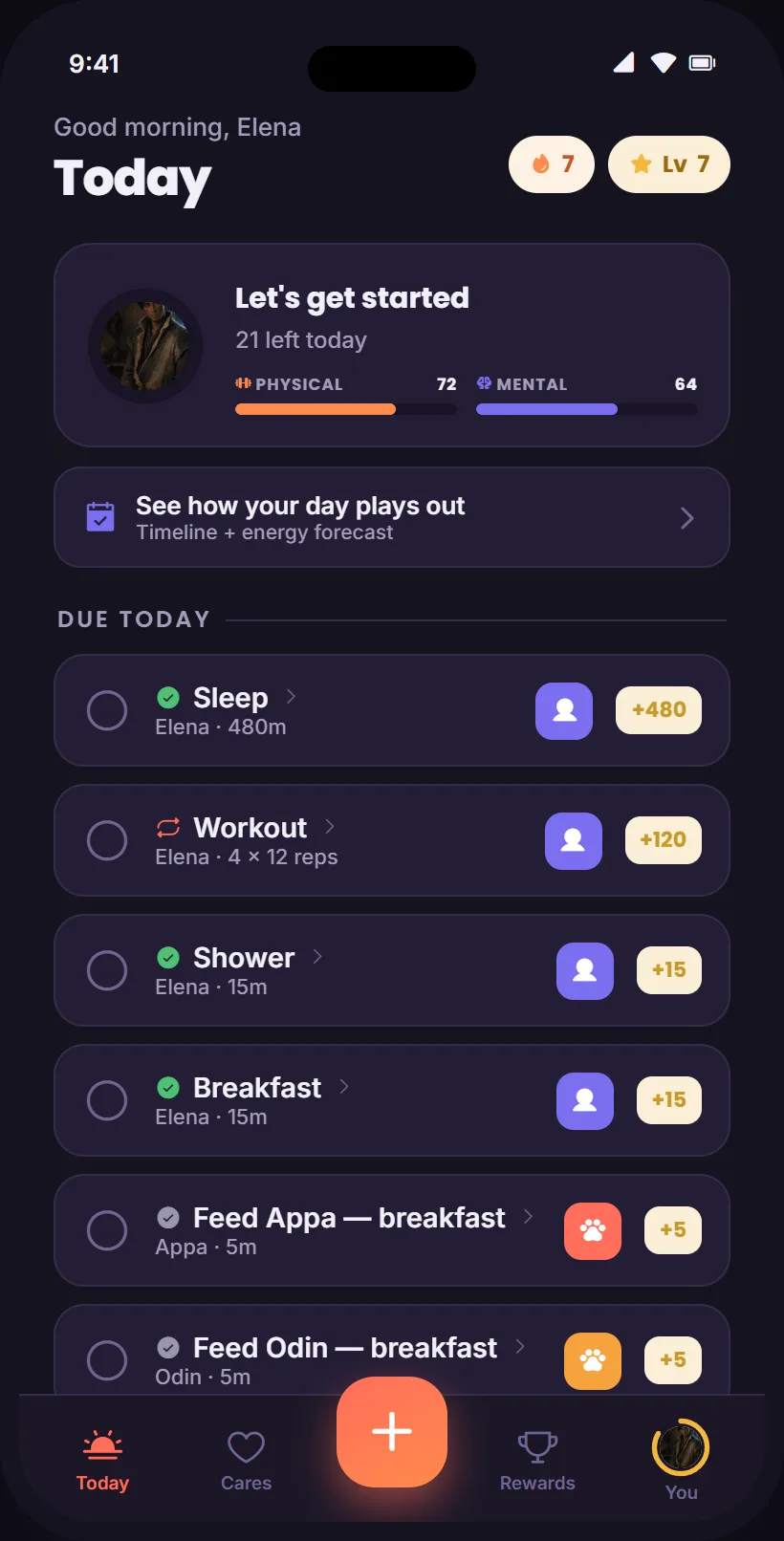
03Today, dark.
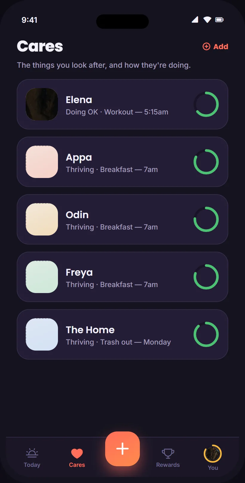
04Cares, dark.
The design system
The screens above are built on a system, and the system is small on purpose: one warm coral for the primary action, a cool purple for the social one, fixed semantic accents for success, warning, info and XP, and a tint pair per Care type so a pet, a person and a home read differently at a glance. Light is the canonical theme and dark is a real second one, both real tokens. Poppins for headings and numbers, Inter for everything else. Radii are generous, shadows are soft, motion celebrates the moments that matter and stays calm elsewhere. The signature component is the Care's health ring.
The design record ships as a design system: sixteen cards for brand, colors, components, spacing and type, the core components as a bundle, and an interactive mobile kit that clicks through onboarding, Today, Cares, Rewards and You. It is here, running: open the design system →
How it was defined
The definition came before the design, and the design is the spec.
- A concept spec with the north star as the feature filter, the model above, and the game layer.
- Five personas and a feature list prioritized P0 to P2, then a feature-by-persona fit that surfaced the gaps: quantitative logging, numbers rather than done or not done, and managed chore charts for kids.
- The energy-model decision, a fork between energy as a daily budget and energy as a need, resolved in favor of the budget with the formulas locked.
- User stories per persona with acceptance criteria, an audit of personas and stories, and a flow and screen map that added shared spaces and roles, a household and a classroom scenario, and their data-model implications.
- Design direction, a style tile, seven hero screens, and three prototype versions, v0.2 with the clickable core loop and onboarding, v0.5 in the premium gamified style, and the v1.0 structural rebuild.
Where it stands
The alpha at todoxp.com is live, and the waitlist is the way in. The new build is defined but not started: the next steps are the data model, the screen map, and folding in the gap features. Character avatars in the prototype are still placeholders.
The most honest summary is that this is the studio venture where the thinking is furthest ahead of the code, and where the discipline shows in what did not ship. A feature that does not serve tasks, relationships or goals is not in the spec.