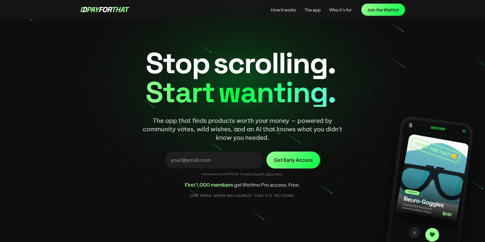
idpayforthat (opens in a new tab) is a demand marketplace. Someone describes a product they wish existed, other people vote and say what they would pay for it, the system looks for things that already solve the problem, and if the gap is real, a builder can pick it up. The phrase people already say out loud, "I'd pay for that", is the product's single action and, if it works, its dataset.
It has a live page, a complete design system, a mobile app designed screen by screen, a desktop surface, a business dashboard, four personas and a written feature list. It has one signup. Mine.
This case study is here because that gap is the interesting part.
What is actually live
One mechanic. You submit an email, you get a welcome email, you land in a Resend audience. Everything around that is real engineering and none of it is the product:
- A ten-section landing page at idpayforthat.com, mobile responsive
- Firebase Firestore behind it, with a per-IP rate limiter at five attempts per ten minutes
- reCAPTCHA v3, invisible, score threshold 0.5, wired to work under Consent Mode v2
- GA4 instrumented for the funnel, shares, nav, scroll depth and exit intent
- Consent Mode v2, default-deny, with a banner and a revoke link
- SEO and LLM discovery: sitemap, robots, JSON-LD, an OG card,
llms.txt - Resend Audiences for storage, sending from the venture's own verified domain
That list is a finished job. It is also the brochure, not the building.
The loop the product is actually for
The wish detail screen is where the whole thesis fits on one page: a stated need, the number of people who want it, the things that already exist and might solve it, the argument about how to make it better, and a handoff to somebody who will build it. Everything else in the product is a way of feeding that screen or reading from it.
Designed, not built
The design of record covers three surfaces. A mobile app of fourteen screens. A desktop web version with the same model. And a business product, a demand explorer with validated signals, willingness-to-pay medians, demand by category and top movers, which is the part someone would actually pay for.
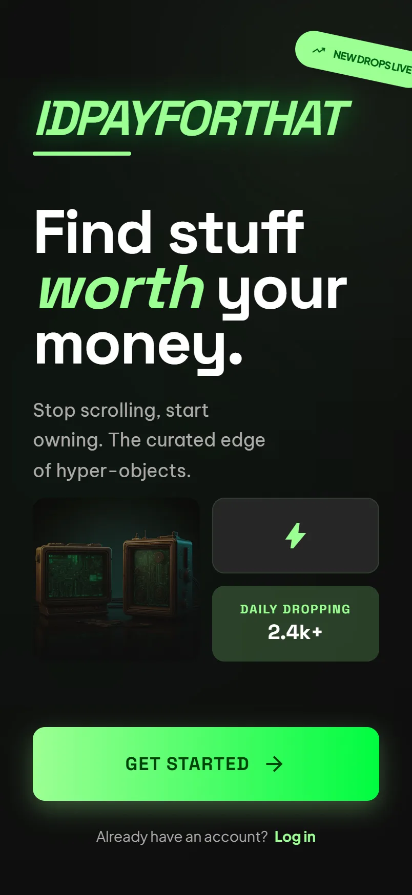
01Welcome. One promise, one way forward.
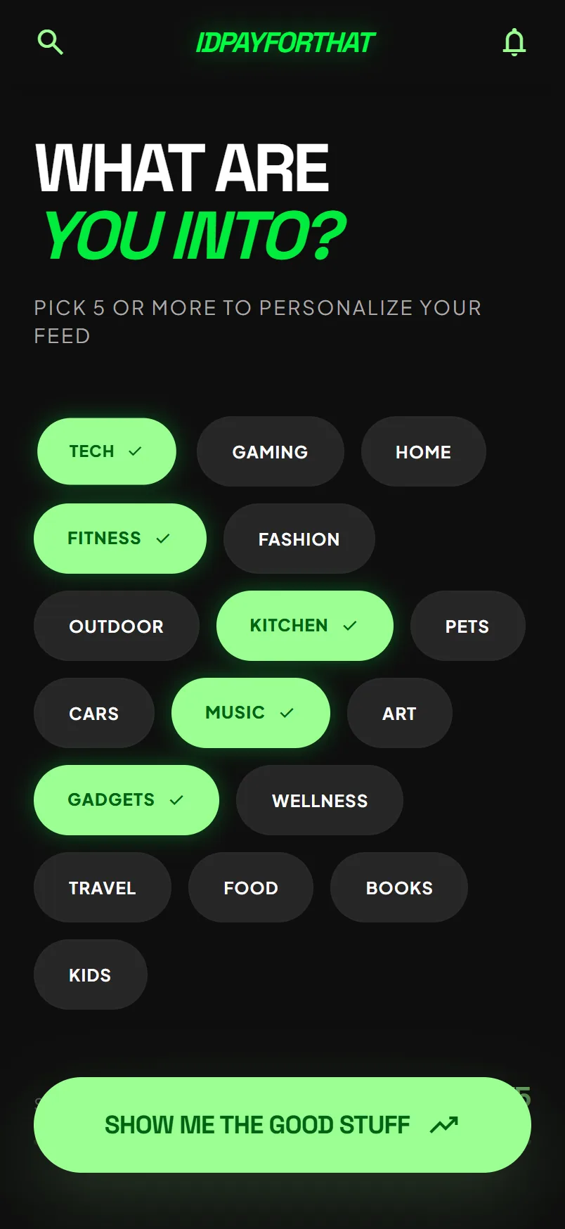
02Interests. Six chips, then straight in.
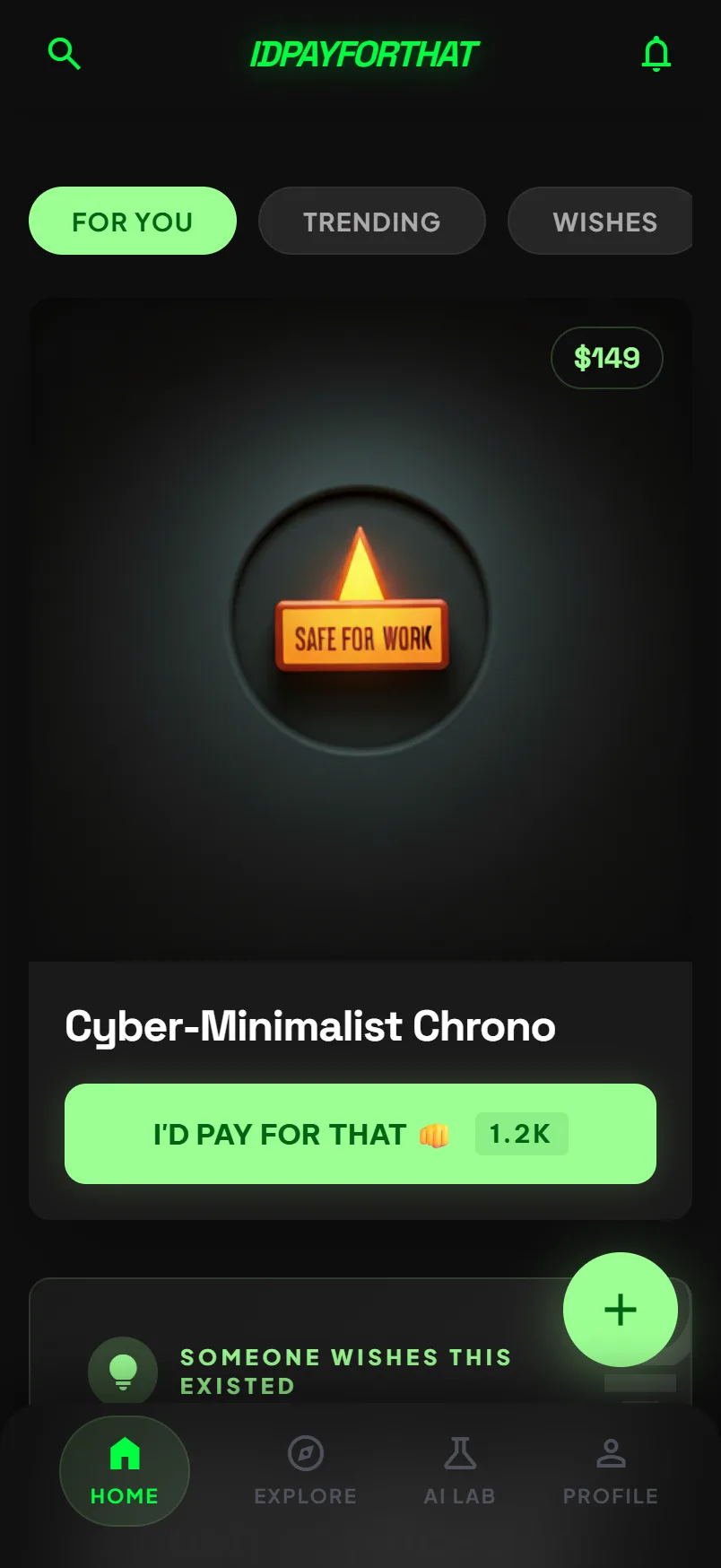
03The feed. Real products and stated wishes in one column, which is the split the product never resolved.
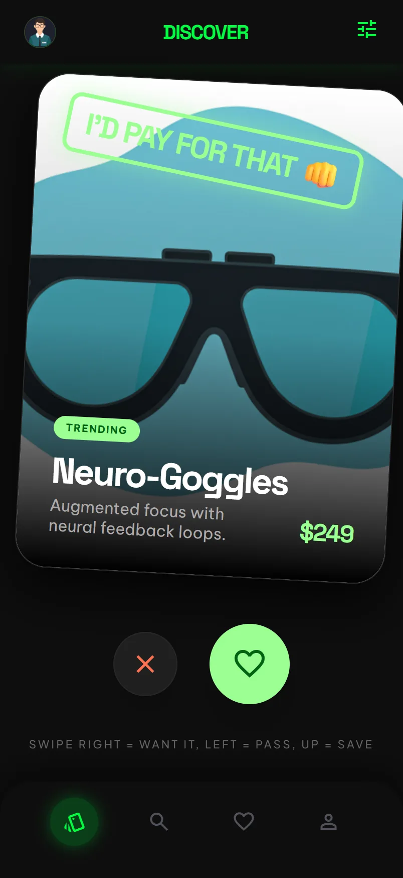
04Swipe. Engaging, and the furthest thing here from stated demand.
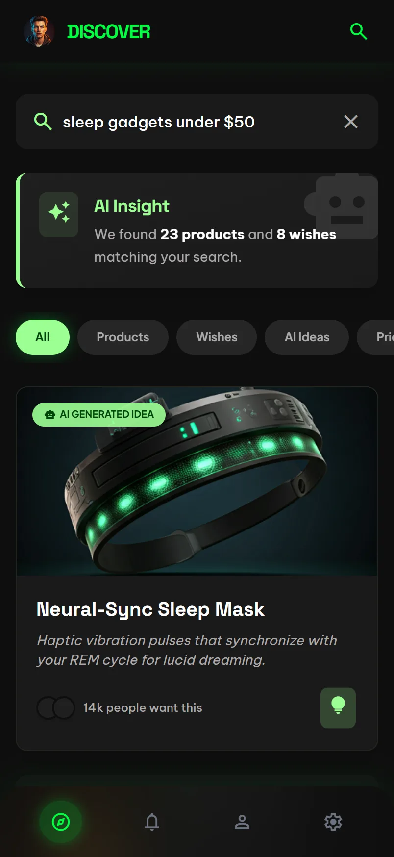
05Search. Results have to say which of them exist and which are wishes.
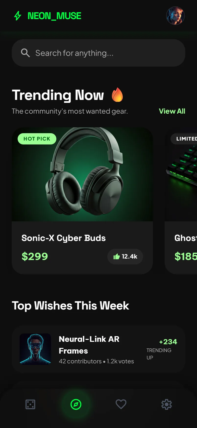
06Explore. Well organized, and reinforcing the identity split.
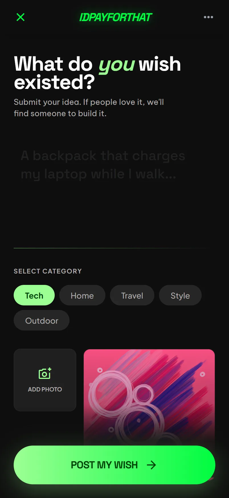
01Post. One sentence, a category, done.
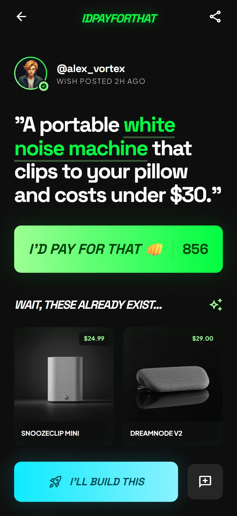
02Wish detail. Need, price, alternatives, argument, handoff.
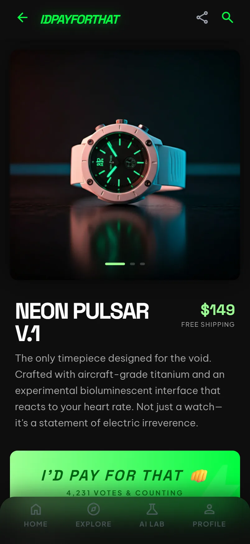
03Product detail. Where to buy it, so a wish can end in a purchase.
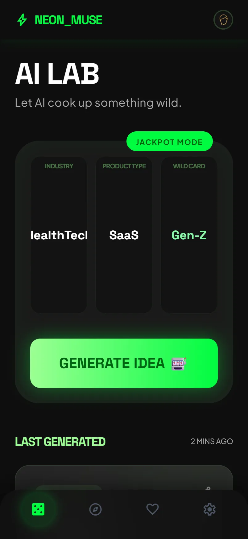
04AI Lab. Fun, and it manufactures the supply the marketplace should be scarce in.
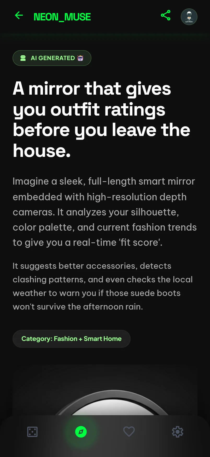
05A generated idea. Synthetic supply needs its own label and its own ranking.
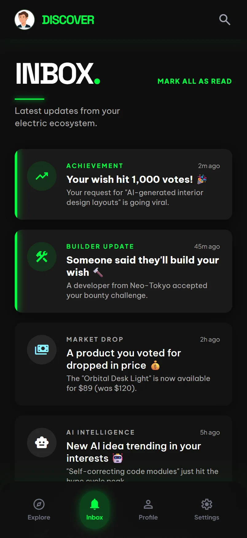
06Notifications. The one that matters is somebody is building it.
Two things in these screens are worth pointing at rather than quietly fixing. Three of them still say NEON_MUSE in the top bar, which was the working name the design started under. And the feed's lead product is not a watch, it is a placeholder card the image generator returned instead of one.
Both are what the design record actually contains. A design of record is a working artifact, not a portfolio exhibit, and cleaning it up on the way to this page would be the same instinct that put the fabricated testimonials on the live one.
None of it shipped. The app exists as a design and an Expo repo that has never been audited; the business dashboard exists as a design only.
The design system
Nineteen components, nineteen documented cards, 138 tokens, one theme.
The brief calls it electric irreverence, and the system is unusually disciplined about it. One saturated green, #00ff41, as the only accent, on a near-black stack that runs #000000 through #0e0e0e to #2c2c2c. Elevation is light rather than shadow: cards lift with a glow, not a drop. Sectioning is done with surface changes and spacing, never with hairline borders. Space Grotesk carries display, headline and mono; Be Vietnam Pro carries body; Plus Jakarta Sans carries labels. The wordmark is not an asset, it is live type, Space Grotesk 700 italic, which is why it can sit inline in a sentence and still look like a logo.
It is the most complete artifact this venture produced, and you can open it and use it.
The week the page was lying
On 4 August 2026 an audit pass fetched the live page for the first time, logged out, and found four things.
Three unbuilt features were presented as shipped. Discover & Vote, Make a Wish and AI Lab each had a screenshot and a description in the present tense, with App Store and Google Play "coming soon" badges under them. None of the three existed in any form a visitor could use.
Two testimonials were attributed to named beta testers. There were no beta testers. One of them, @alex_vortex, is the sample-data handle from the design system's own wish detail screen: a placeholder in a mock had been promoted into a quote from a person.
The three stat counters rendered as 0%, 0K+ and $0, an animated counter that never ran, sitting next to a sentence claiming 340 of the generated ideas were good.
And the signup count read "Join 1 others on the waitlist", which was both a grammar bug and, accidentally, the only honest number on the page.
All of it was fixed and merged the next day, 5 August, and verified on 13 August. I am keeping it in this case study because the failure is more useful than the fix. Nobody set out to lie. A landing page was written to describe the product as it was designed, at a moment when the product as designed and the product as built had drifted completely apart, and no step in the process compared the two. The audit that caught it was not a person having a hunch. It was a scheduled pass whose only job was to read the live surface and write down what it said.
One signup, and what that does and does not mean
The north star was a hundred real signups. It reached one, and the one is me.
The number is easy to misread, so here is the whole of it. The page went up in April 2026. It was parked on 2 September. In the 140 days between, the number of directory submissions was zero, the number of Reddit posts was zero, the number of people told about it in any channel was zero. Launch copy for four directories and two subreddits was written and approved on 5 August and was still sitting unposted forty days later.
Parked after failing to get traction and parked before attempting traction are different facts, and only the second one is true here. The market did not say no. The market was never asked. A finished product that nobody has started is a fine thing to stop; what is not fine is recording it as evidence of anything.
One thing did come out of the distribution work that was worth the effort: r/SideProject's rules forbid exactly the post that was drafted for it, because they do not allow links to a waiting list. r/SomebodyMakeThis does. That is a real constraint on every waitlist-stage venture, and it was found by reading the rules rather than by getting a post removed.
What I would do differently
The product tried to be six things at once: shop, swipe, wish, generate, discuss and build. The wish loop is the only one of those that is hard to copy, and it is the one the design serves best. A second version starts there and defers the feed, the catalog, the AI generator and the enterprise analytics until the loop produces behavior worth analyzing.
The other change is order. This venture had a design system before it had a single user conversation. All four personas are grounded in one source, the site's own "Who it's for" copy, and every one of them is labeled provisional in the vault for that reason. No interviews, no analytics segmentation, no beta cohort. Writing that down honestly was useful; not having it was the actual problem.
The category has since started to form on its own, which is the clearest signal in this whole record: dupay.lol now runs a live demand market ranked by votes and willingness to pay. Someone asked the market. It answered. It just was not this.