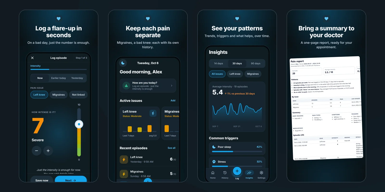
What shipped: an app for iPhone, Android and the web from one Expo codebase, a design system with a guardrail in CI, a Figma library that mirrors it, a backend on Firebase, web and in-app billing, store listings for both stores, and a marketing site.
- In private beta. The app runs on Google Play internal testing and TestFlight, and payments are in test mode. The stores wait until people with chronic pain have used it for two weeks; the beta sign-up is open.
- 42 product stories with IDs, each tied to a test, so every platform and every test round checks against the same definition.
- Not a medical device. It doesn't diagnose or treat anything. It keeps a record.
The screens on this page show demo data: Alex and Sam are not real people.
The problem
Pain diaries get abandoned because logging takes effort at exactly the moment the person has none. Then the doctor gets a vague memory, "it's been bad lately", instead of a history.
Every decision below starts from one premise: people open this app while they hurt. Every screen has one obvious action, nothing is bright or sharp, and the touch targets are big enough for an unsteady thumb.
Product decisions
One number is a complete log
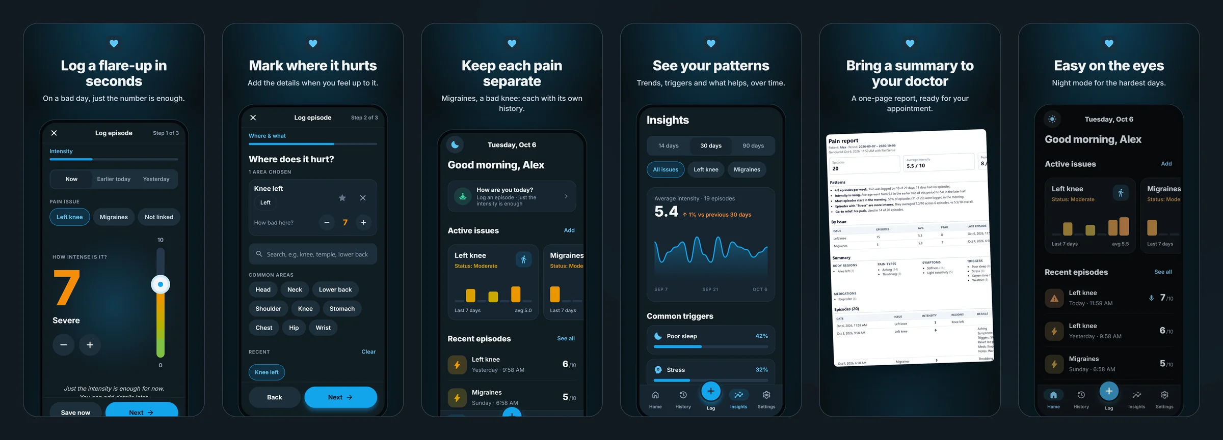
On a bad day the only thing worth asking for is the intensity. Step one of the log is a single slider with a Save now button, and that alone is a complete episode. Where it hurt, the type of pain, triggers, what helped, how long it lasted, a voice or video note: all of it is optional and can be added later, when the person feels up to it. The copy says so on the screen: just the intensity is enough for now.
Each pain keeps its own story
Most people with chronic pain have more than one problem: migraines, a lower back, a left knee. Episodes are grouped into pain issues, each set up once with its own history and its own seven-day trend on the home screen. The doctor sees the migraines as migraines, not as noise around the knee.
One task at a time
Testing on a real iPhone showed that Save stayed tappable in the middle of a recording. That became a design rule, written into the design system: while the app is doing something, everything that would interrupt it waits. An audit against the rule found fourteen more places that broke it, and all of them were fixed in the same release.
Don't fake features the product doesn't have
The design concepts included a weather alert ("pressure is dropping"), medication reminders, caregiver sharing and a daily check-in. None of them are in the product, on purpose. They stay out until the core loop of logging and reviewing is proven with real people, and the marketing makes no promise the app can't keep.
Privacy is part of the product
Health data needs more than a privacy policy. Usage analytics are off everywhere, so nothing about what someone does in a health app leaves their device. A one-time consent screen comes before the first log. Episodes logged with no signal are queued on the phone and sync later, even if the app is closed. Voice and video notes play through links that expire after fifteen minutes, and deleting the account removes everything, payment records included.
A price set for conversion, not cost
Running costs are about $27 to $47 a month, and per-person costs are cents. Pro costs $4.99 a month or $34.99 a year, lowered from $9.99 and $79.99 once a written cost model showed that the old price only made sense for a product with reviews it doesn't have yet. Free covers unlimited logging, issues, the body map, the last thirty days and Night mode. Pro adds full history, 90-day trends, the PDF report, and voice and video notes, with video capped at a minute so storage stays the only cost that grows, and stays small.
Design system
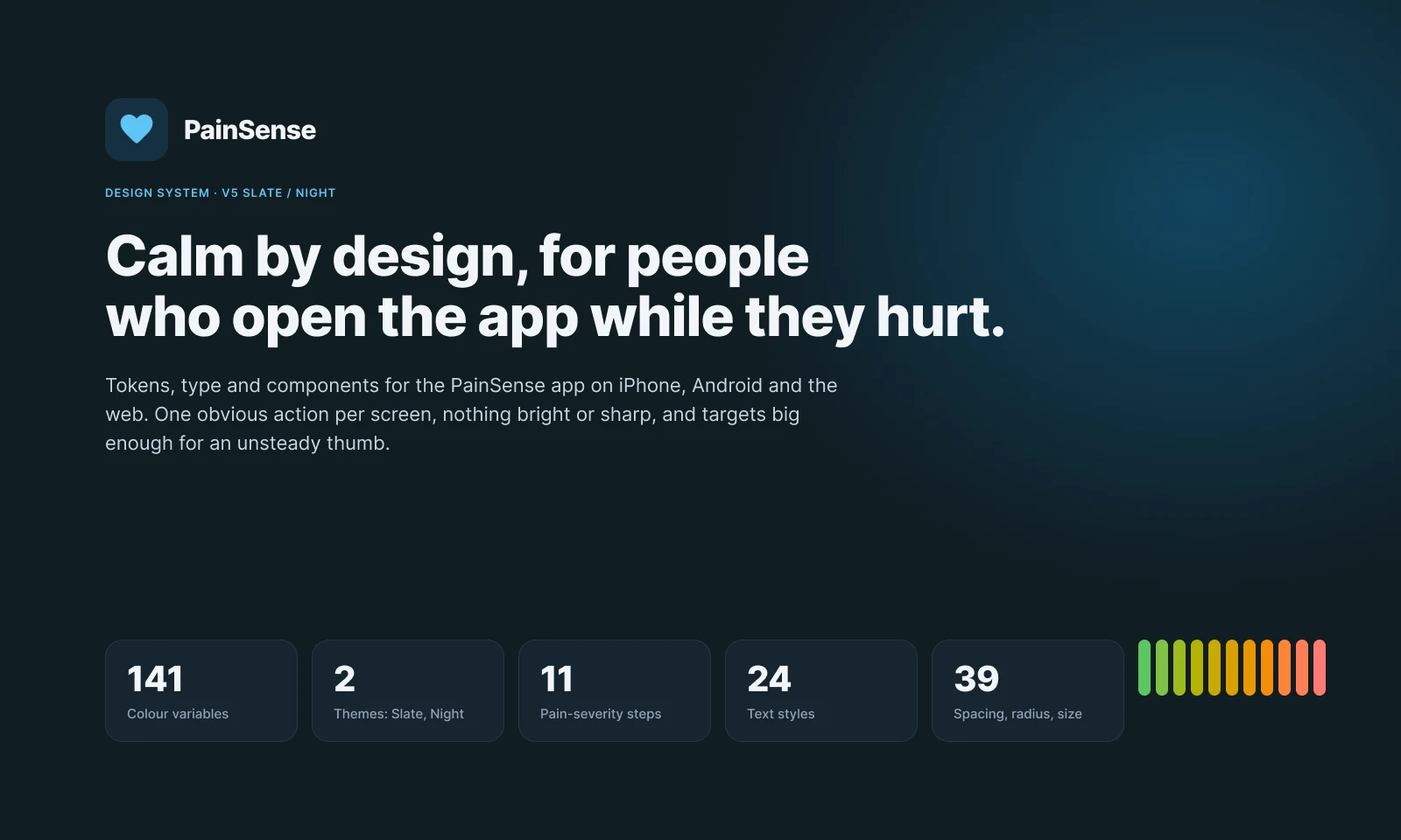
The design system is code first. The tokens live in the app's repository, every screen is built from them, and a check in CI fails a pull request that reaches for a raw value, which is how the app reached zero design debt and stays there.
Two themes carry it. Slate is the everyday dark theme; Night is darker still, for a dark room and a headache. Pain severity has its own eleven-step scale, 0 to 10, from green through amber to a soft coral, so the same number always looks the same wherever it appears: the slider, an episode row, the trend chart, the report.
 The severity meter at four values. One component, one variant per band, the colour from the severity scale.
In Figma
Designers work in Figma, so the system is mirrored there too. Code stays the source of truth; the Figma library follows it, built from the same token file.
- Foundations: 141 colour variables with Slate and Night as modes, 39 spacing, radius and size variables, 24 Inter text styles and 4 shadows.
- Components, only what the screens need: 48 icons from the app's own icon font, then 27 components, from Button, Chip and Switch to the PainSlider, the SeverityMeter, EpisodeRow, IssueCard and the TrendChart.
- Product screens: 13 iPhone screens in a second file, every one built from live instances of the published library, with nothing detached.
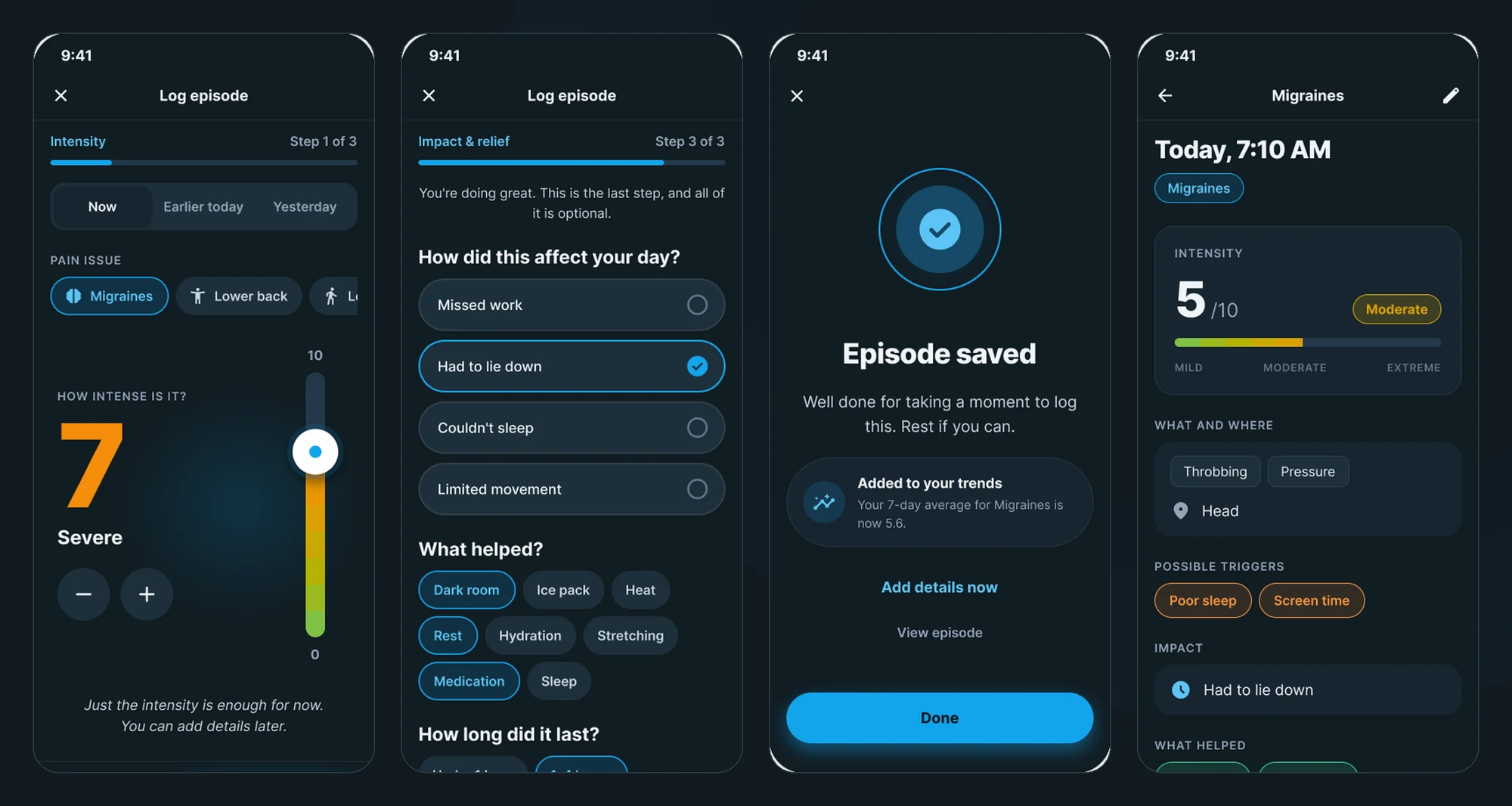
The product file is wired into a prototype with two flows, first run and daily use: the onboarding, the tab bar, the whole log flow, an episode, and a Night mode toggle.
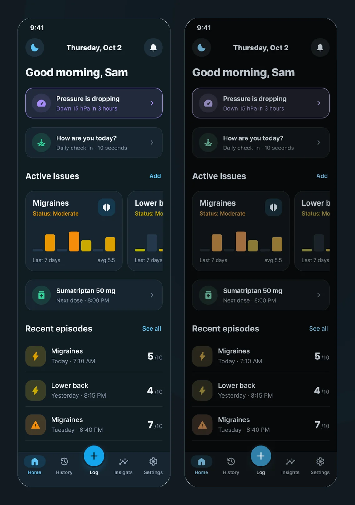 Home in Slate and in Night: the same frame, only the variable mode changed. The weather and medication cards are design concepts the product deliberately does not ship.
The prototype is clickable here: click through the prototype →. The library is open to look through: open the design system in Figma →
How it's built
- One codebase, three platforms: Expo and React Native for iPhone, Android and the web, with native Google sign-in and Sign in with Apple.
- Backend: Firebase Auth, Firestore, Storage and nine Cloud Functions, with security rules that validate episodes, issues and profiles.
- Billing: Stripe on the web and RevenueCat in the apps, behind one entitlement computed on the server, so the app and the storage rules can never disagree about who has Pro.
- Releases: every change is a pull request with tests; semantic-release cuts the version; previews run against a separate staging project so they never touch real data; JavaScript fixes reach testers over the air, and store builds are only for native changes.
- Marketing site: a separate Astro site on Vercel that shares the app's colour tokens and plan file. The first version was built in Expo and looked like it; React Native views make poor web pages.
Where it stands
PainSense is built and running, and it is not in the stores yet. Both store builds are on invite-only test tracks, payments are in test mode, and the listings are saved as drafts.
That is deliberate. The positioning and the personas are drafts until people with chronic pain have used the app, so the next step is a two-week trial with five of them. The question the trial has to answer is the one the whole product rests on: whether logging really takes seconds on a bad day, and whether the summary is something a doctor will read.
If you live with recurring pain and would like to help answer it, the sign-up takes a minute: join the beta →
Click through the prototype → · Open the design system in Figma →